Scope

Persona

User journey

User flow

Sketches

UI

Mockup

Conclusion

Getting Cat specific in booking vet visits.

What if vet virtual health care included cats more in their booking process? Follow my journey of understanding what information a user needs to provide to get cat-specific care.
Role: Product Designer & Researcher
Tools: Figma

UX/UI
Persona
Journey map
Sketches
UI Decisions
Userflow
Mockup
Prototype

Let's get the cat owner informed and Vets happy

Project Description

How may we provide cat owners with a quality, stress-free, and informed experience when booking a virtual appointment as a new user?

Scope & Process

Orange Cat Processing

This project is inspired by my time & designs at Rocket Doctor and a direct competitor to this project: Vester. My knowledge comes from listening to physicians & staff by conducting primary research, and competitive analysis at Rocket Doctor on understanding what elements are required for virtual health. While I can't share the research outcome with readers, I can discuss my process and show a design that takes into consideration of my research.

Length of project: 1 week
Members: Myself
Deliverable outcome: Persona, User Journey, User flow, sketches, high-fi, prototype
Purpose: To showcase my process after research, a competitive analysis & requirement gathering has been completed.
Designs for: Booking your first appointment at Orange Cat Care on a computer
Primary & Secondary User

My orange cat user experience

The roles that this design would impact the most are the pet owner, vet & patient . The primary user will be the Pet owner while taking into consideration of the vet's pain points, and frustrations because the pet owner's experience will impact the vet heavily. It can be challenging to find a balance between having both users happy. That is why I ensure that we have both perspectives heard and their absolute necessities noted.

Nina Sunflower

Pet Owner

32

Bio
Nina is a teacher, she's seen as a very kind person with an obsession with her adopted two cats Toast and Butter. If she's not at work, she's tutoring or volunteering her time.

Pain Points

  • Time
  • Uncertainty in Virtual Care
  • Confused on steps

Frustrations

  • Confused on what info to provide or steps need to take
  • Long waits & filling out long forms
  • Unsure if problem is dire or is for virtual care
  • Confused on category their cat's issue fits within

"Going to the vet stresses me out because I don't have the time, I don't want my cats to catch anything from another pet"

Dr. Maria Perez

Vet

36

Bio
Maria is a vet and a mom of 2 kids and 3 cats. lately, she's been rather busy with home life but wants to get back to her passion for caring for animals. She's opted into virtual pet care.

Pain Points

  • Pet owner expectations
  • Lack of pet information
  • Uninformed pet owners

Frustrations

  • Pet owners have certain expectations that can't be mete
  • Not enough medical info on pet makes it difficult to come to a dignosis
  • Pet owners unaware of what's expected of them during appointments

"It would help if patient's understood that we don't always give prescriptions and that they are on time with a camera on"

Toast

Patient

Bio
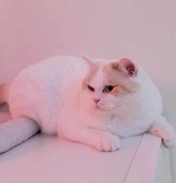
Toast is a 1-year-old British shorthair, he likes bird watching, and cuddles. He hates the crate and becomes a master escape artist when it's brought out.

Pain Points

  • Crate & Car rides
  • Staying still
  • Bleeding when passing stool

Frustrations

  • Being around loud noises at the vet
  • Staying still without treats
  • Feels to sick to eat

Other Health info

  • Allergic to beef
  • Had diarrhea a month ago
  • Used to have littler box trouble

"Meow"


What is Nina's & Toast story?

Nina's cat, Toast, who she adopted off the street when he was a kitten, is having diarrhea when passing stool. She doesn't have the time to go see a vet in person. She'd like to set up an appointment for Toast at the earliest availability as a new user . She wants to make sure her Toast's medical history is understood and taken into consideration.


cat user journeymap

How does a persona, and journey map impact my decision-making?

Developing a persona, and user journey map always aids me in making user-flow decisions. This is because it breaks it down into large main steps and helps organize what the user will encounter or see in each step. It leaves out the guesswork when I'm producing the user flow. In addition adding the pain points and frustrations , allow me to think more in-depth when creating the user-flow.

For example , the need to gather more info for the vet so that it'sless likely the vet will want to cancel or request more information from the pet owner, thus saving time from going back and forth.

Another example is the pet owner won't have to wonder if their pet's ailment is appropriate for virtual health at the start of the flow. I also allow them to explore their options before deciding to create an account, as studies show that users are less likely to drop off if they don't have to create an account first .

cat user journeymap

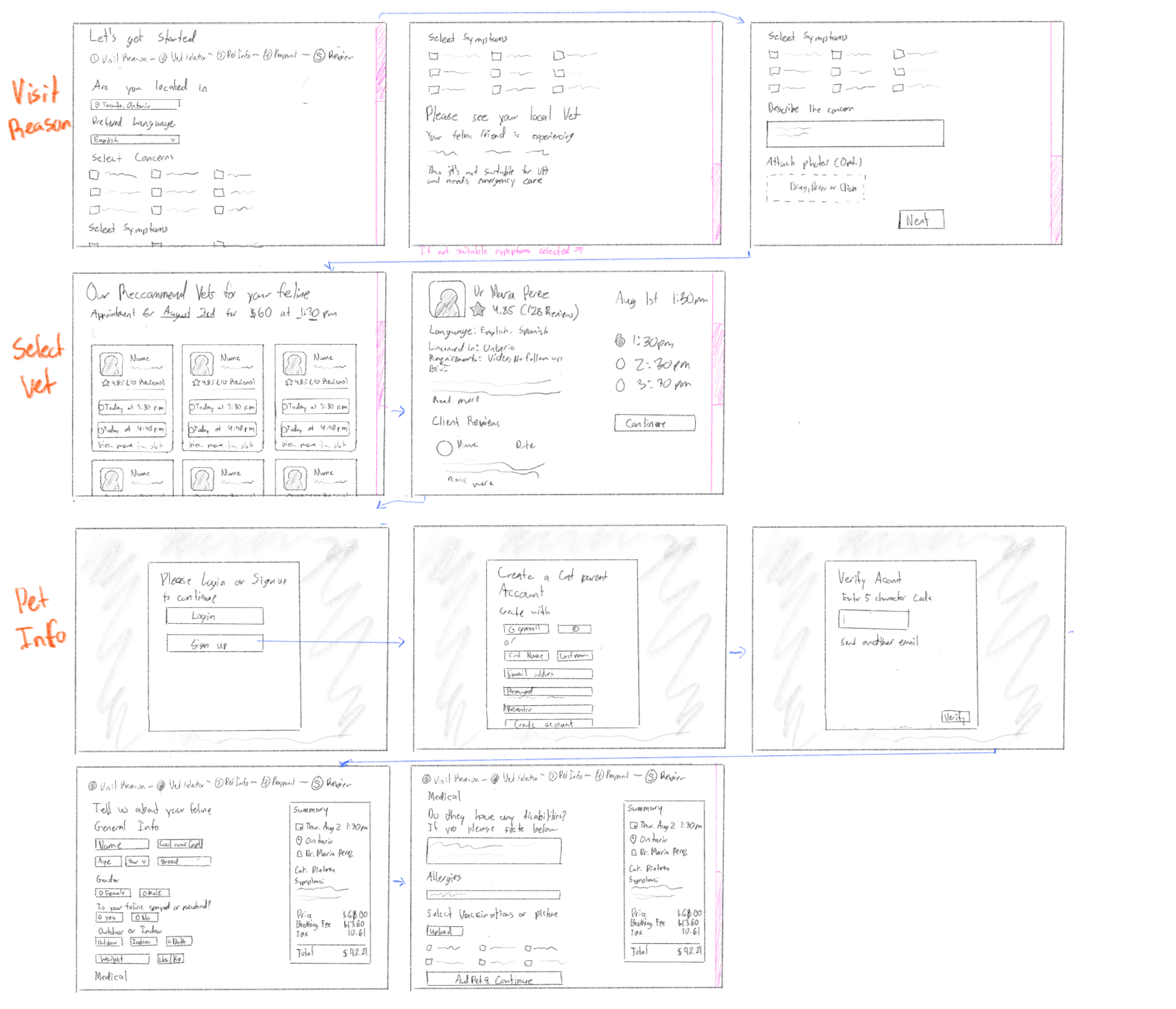
Sketches, why?

Not every scenario requires it but with larger new designs I always tend to sketch first.

Why? Because while it's not the final design, and may not be where every element is located, it helps to remind what needs to be on the page, and what it could look like when doing mid-fi, or high-fi. It also saves time when doing the final design, knowing the direction it needs to take. For this sketch I've decided to do visit reason, select vet & pet info as something like payment is less of a complicated design and my focus is on these main parts.

cat user journeymap

UI Decisions

Let's speak in their language

#F38E61
#D65E5E
#744D4D
#756262
#B2A9AC
#DECFD3
#FFFEFB

Tones, Colors, Font & more

I chose to make the tone friendly and leaning towards casual. Orange is often used in virtual health and a big company that does this is Maple. Orange represents energy and happiness. Most importantly, on social media orange cat energy is chaotic energy; the stereotype is that they get themselves in trouble often, thus: Orange cat care. I've added tones of pinkish red as it helps stand out from the competitors. My font choice is geometric as it geometric fonts are known to appear more friendly. Design-wise, I chose to use rounded corners as it also appears more friendly. The sharper the corners the more firm or formal it feels.


Accessability

I always choose a san-serif font that is over 16px as it's known to be the most readable for digital media. The colors I choose also pass the contrast test to ensure it's readable. In addition to language, it's important we don't use big words or jargon that are difficult to understand. The rule is: it must be at least below the eighth-grade reading level. Another rule that I follow is to never use the darkest black with the whitest white. I myself find it difficult and painful to read, and there are many others that also find it problematic. This is normally a problem when in its dark mode but, not using a straight-on black is also more visually appealing and less harsh on your eyes.


Step 1

Visit Reasons/Concerns

Is this suitable for virtual care?

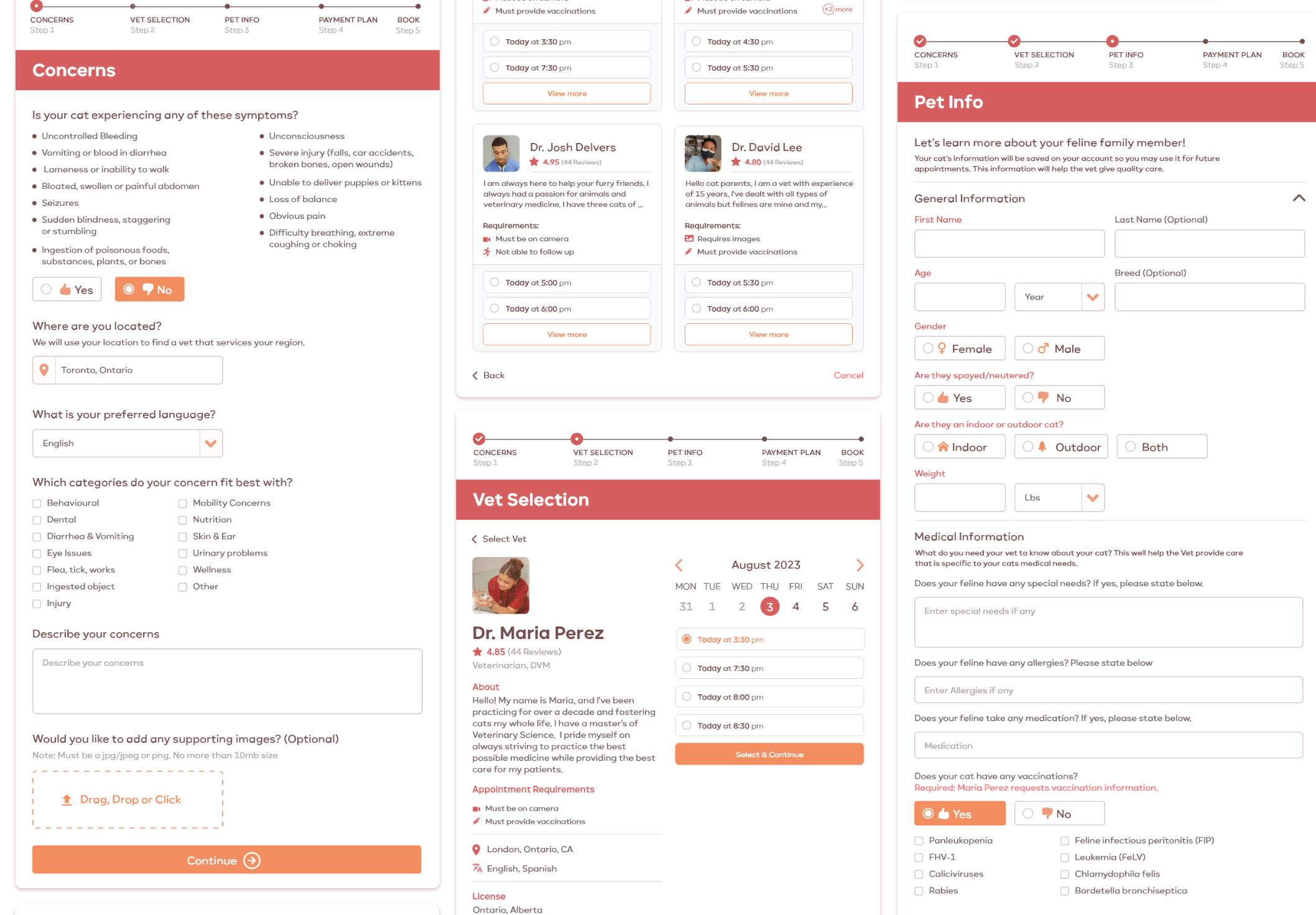
There's always a bit of concern from both sides from pet owner to vet if the concern is suitable for virtual care. The solution I've narrowed down to reduce the pain point is for the pet owner themselves to verify that their cat does not need immediate attention. This helps vets worry less if the pet owner is coming for an issue they will need to tell them that they must go to a local vet.

Pain points solved: Uncertainty, Expectations

ecobin

No login required

At the visit reason/concern step we don't require you to sign-up or log in. Research shows that users are more likely to continue the process if they're already invested. They will get to see the process and feel more confident in signing up after.

Step 2

Vet Selection

Empower pet owners with easy decisions?

For vet selection, I've provided 4 options for the pet owner to choose from. Normally odd numbers are best, but making it feel like they have one more option could help in case the 3 vets they see have requirements they're not sure they can fill. It's important that the pet owner themselves understand what theVet requires from them to make the appointment as simple, informed, and clear of uncertaintyfor both users.

Pain points solved: Uncertainty, Time-consuming, Uninformed

ecobin

Hmm, what time should I pick?

While only two display, they may always click more. If they have a specific time and date they'd like, they may also select the date and time to suit their availability.

ecobin

I want to know more

When clicking on a time slot, it'll give a full view of the vet. This is just to understand the vet's requirements, and language, and get more information about them before confirming. It's to create trust and certainty about their decision.

ecobin

Step 2.5

Sign-up

Be Inclusive & gather required information

After the pet owner selects their time slot , the time slot will be held for 15 minutes and are required to sign up. At this point we require their province & postal code (by default it'll be prefilled with Ontario as the user selected it previously), which will be used to pick up prescriptions. We ask for a phone number in case a staff member of orange cat care needs to reach outto them. We also have a field for their pronouns so they are addressed as they'd like to be addressed as.

ecobin

Step 3

Pet Information

Provide quality care

In order for a vet to provide quality care, they will require key information. When creating the design I gathered questions vet's ask new vistors. In addition, I also referenced Vester but even Vester was issing some information, such as allergies, medications, vaccinations, and outdoor/indoor(which is very important when it comes to cats). After working at rocket doctor, I understood the importance of physicianshaving this information available as it's very difficult for them to feel confident in their diagnosis if they don't.

Pain point: Pet info, Uncertainity

ecobin

Booking Summary

At this step I also added the booking summary view to the right, so users may see the date, time, vet, what it's for, description, and requirements. It's very important pet owners are reminded of the requirements so that when the appointment takes place, they are prepared and aware. After the appointment is booked they will receive an email with additional steps and reminders. However, in this flow, it will not be explored so as to not go out of scope.

ecobin

Step 1-5

Prototype

View the full user flow

To view the full Userflow, including payment plan & purchase, please click the link below:

Closure

My inspiration

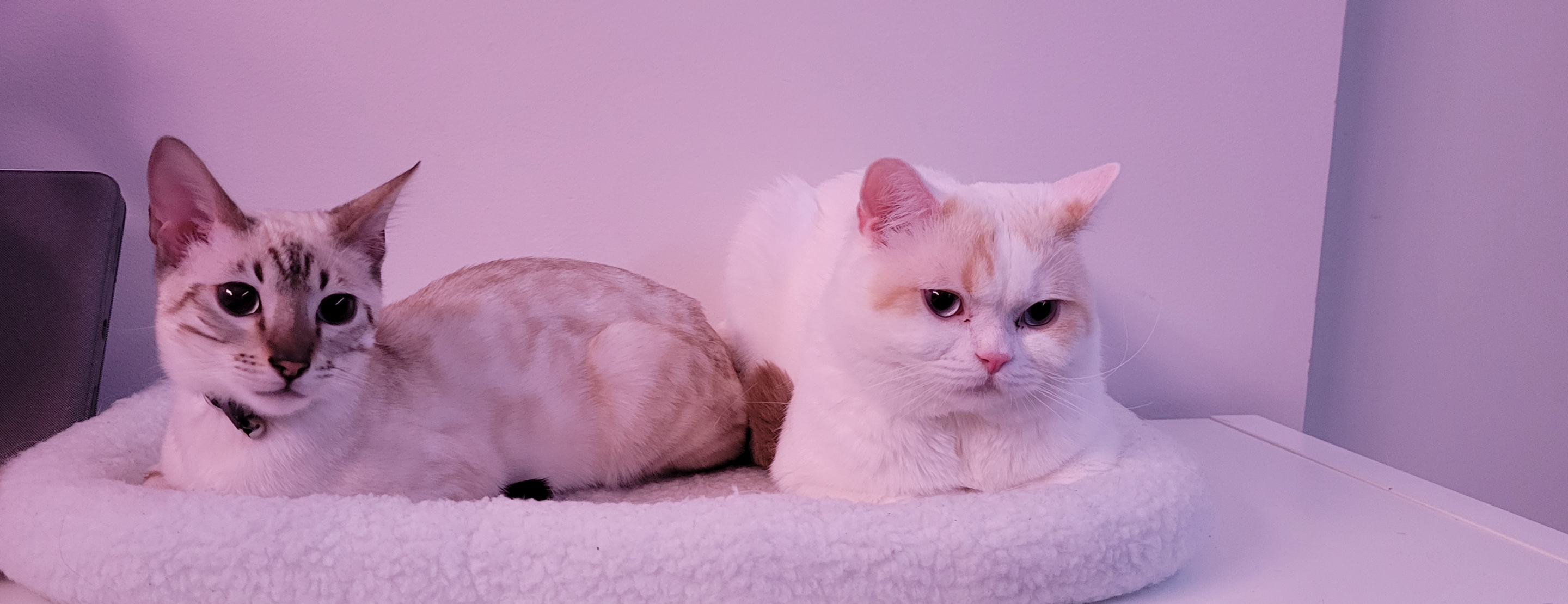
This project was taking into consideration of my work at rocket doctor and using Vester to help navigate pet care with my own personal experience in taking my own cats (Storm Trooper on the left, Snowball on the right) to the vet. I felt that there should be cat-specific care online, just like dogs and other pets they have their own unique set of problems and questions to ask. There was certain information even some vets weren't too aware of, like our Bengal kitten whose at risk to have a bad reaction to a certain drug. Thus, I believe cat-specific virtual health care would be useful one day.


Need an experienced research-driven designer, to improve your software on your team?

I'm currently open for a full-time remote UX/UI or Product Design position.

Contact me at z.risi@yahoo.ca