Inform users without overwhelming them.
Creating the optimal booking flow for digital nomads to book a co-working space efficiently and to their individual needs. Includes competitor anaylsis, user research, UX and UI.
Creating the optimal booking flow for digital nomads to book a co-working space efficiently and to their individual needs. Includes competitor anaylsis, user research, UX and UI.
A platform for digital nomads to find co-working spaces that meets their individual needs, designing specifically their booking flow. How may we provide and receive an abundant amount of information from the user without overwhelming them?

Designing a booking flow that is easy and quick for the user has a lot of
complexity.
There is plenty of information that must be presented
to the
user
and plenty back must be
given
to the co-working space. The goal is to make it as
seamless, individual
to the user as possible while including all
information needed
without
having the feeling of being
overwhelmed.
We used previous research we've done on a co-working space that involved
interviews, surveys, and observation. Utilizing our previous research and knowledge of
the booking flow in our current company help make a ber case.
How may we provide and receive an abundant amount of information
from the user without overwhelming them?
The research, UX & UI is created by myself and Fei Huang.
This page and written content are done by myself.
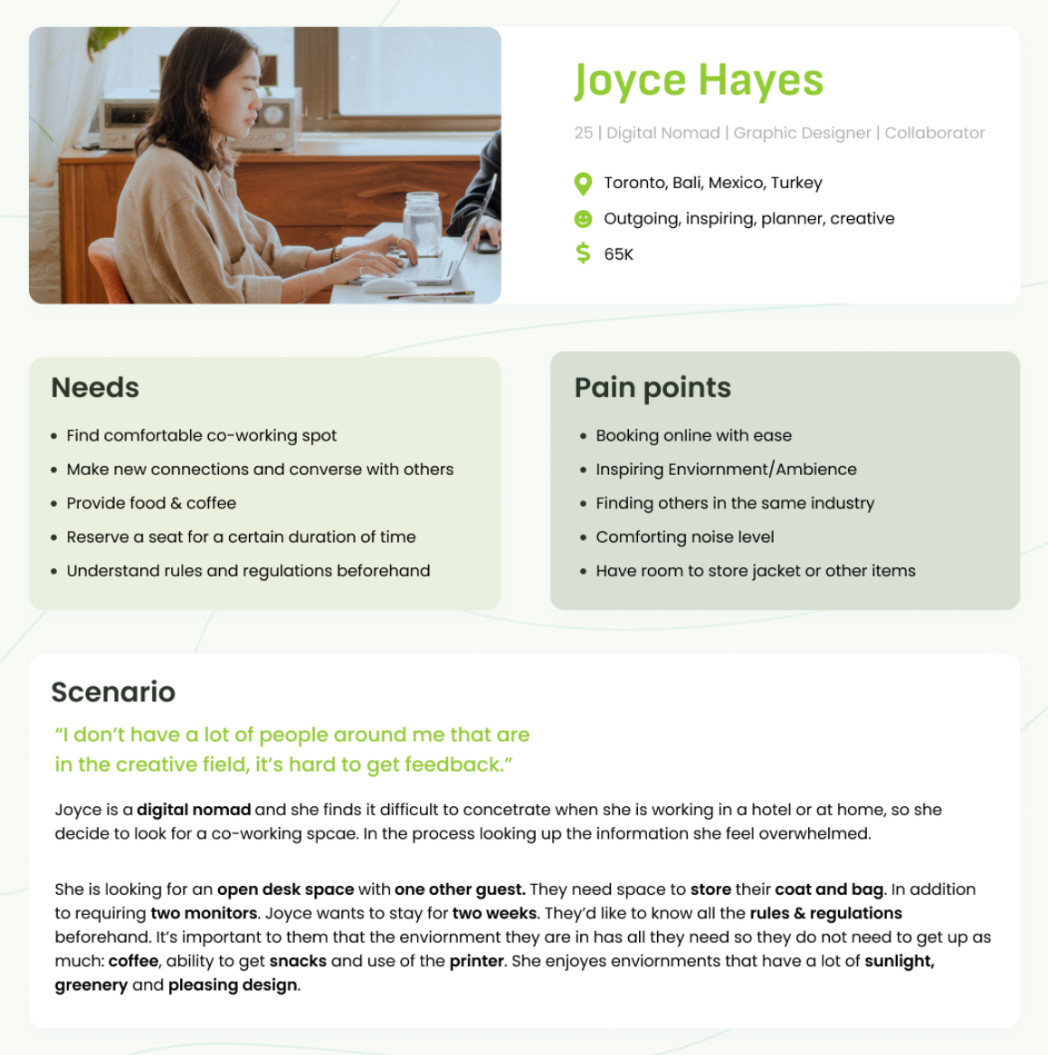
Before we get into discovering the flow; who are the users of co-working spaces? There are freelancers, remote workers and digital nomads who want more than working in isolation in their home offices, bedrooms or kitchens. These individuals may want to divide work from home by switching locations, make new connections or simply don't have the ideal space to work. Many users who use co-working spaces fall into this category. Back when I wanted to live the digital nomad life, I got recommended to go to co-working spaces to meet new people that were travellers like myself.

Currently, the majority of websites
only allow enquiry
or
purchase of a day pass.
Many do not allow to easily
book online
. We find this an inconvenience as the
timely response from an enquiry can vary. However, I also suspect it is to
ensure the people coming in are genuine in their use of the space. How are
we able to confirm genuine use when booking online? My suggestion making
a requirement for users to use connect Linkedin or a business email as I've
seen some competitors do.
Below I mapped out the user flows of two major competitors: Wework and
coworker.
I found that often it would put me through a loop or it would only allow me to
send enquiry request.
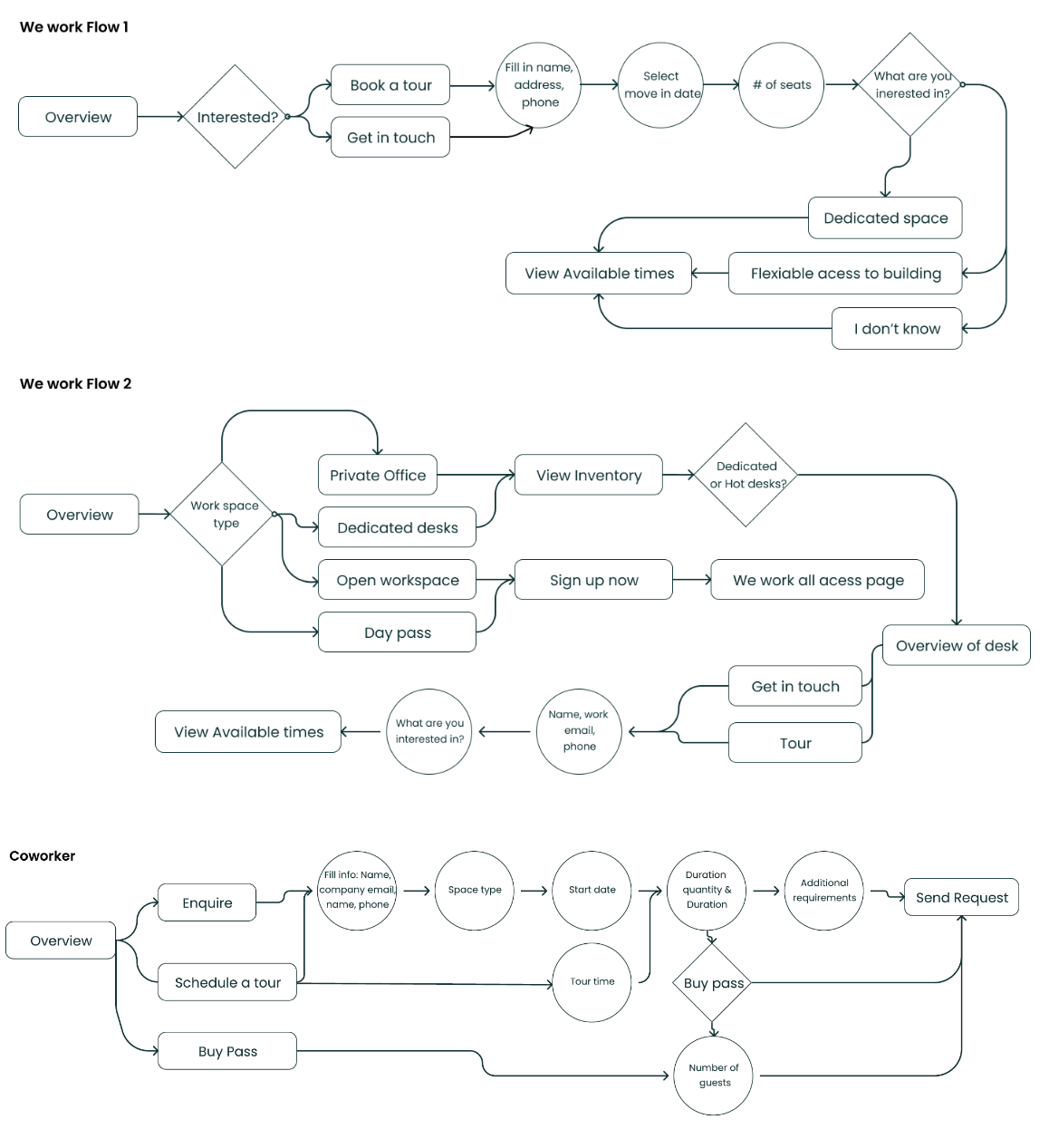
We established all the information that our competitors put in to show the user what this co-working space has. In summary: Location, images, price, promotions, description, status (their capacity), amenities, reviews, Covid regulations, similar rooms and plans.
Environment
Based on interviews, surveys, and observations at
a co-working space we narrowed down our main takebacks.
The environment places a high impact on our productivity
or lack of a good environment. Greenery, natural sunlight,
noise level, and temperatureare all major impacts. Some
enjoy warmer environments while others feel uncomfortable.
Community
We found that many placed importance on the community
as well, finding others who wanted to collaborate , in
the same industry or make connections .
Other
Storage & Regulations for space is another important
factor that we haven't seen too much on other websites.
Where do they store their coats? And where are the rules?
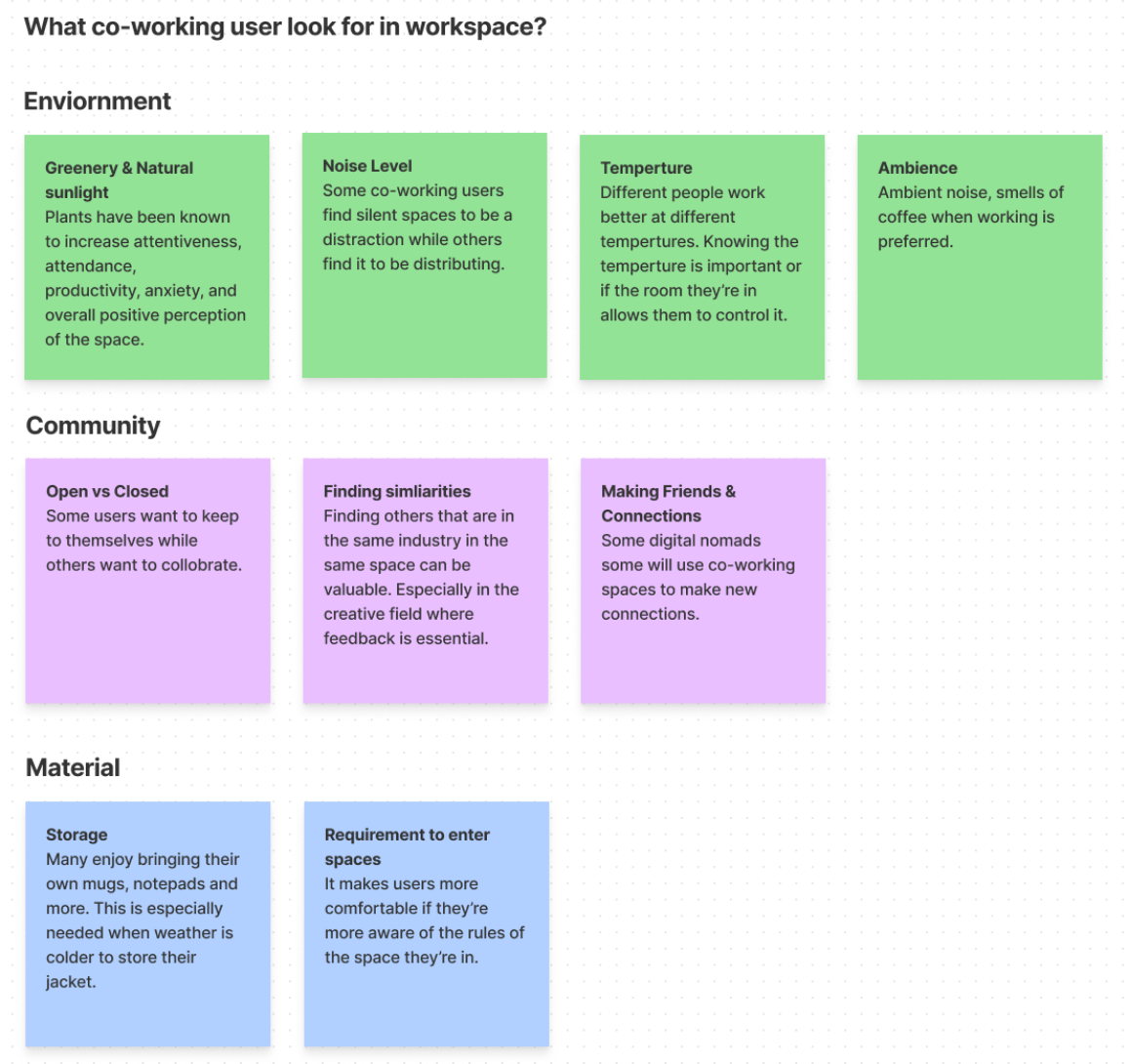
The majority of us experienced the annoyance of
someone sitting in our seat even if it's not really our seat.
Even worse when it is a seat we've paid for. That concludes
we must give the ability to select a seat in case they will
be coming back frequently even for public seats we use frequently.
Here are some quotes that stood out to us:
My Spot
"Once someone gets comfortable with their spot, it becomes their spot.
Other
community members identify that.”
Industry
“I don’t have a lot of people here that are in the creative field, it’s hard to get feedback.”
Interact
“I like that there’s a possibility to interact with people I wouldn’t normally.

We choose a green colorscheme
because of importance of having greenery in the workspace is.
Margin, padding, grid
We used google material design as reference.
Using a 12 column grid as we're designing for
high DPI laptop screen. We're using 8, 16, 24 and 40
for paddings and margins.
Font
Headers we used Helvetica because it's a sans-serif and they are
known to be the most user friendly to read on screens.
Font size of 14px as Poppins were chosen as paragraph text.
Normally 15 and up is recommended but because Poppins is rather
a large font itself we decided on 14. In addition we left aligned
all text (center text is not known to be user friendly) and
strayed away from making titles all CAPS as it's more difficult to read.
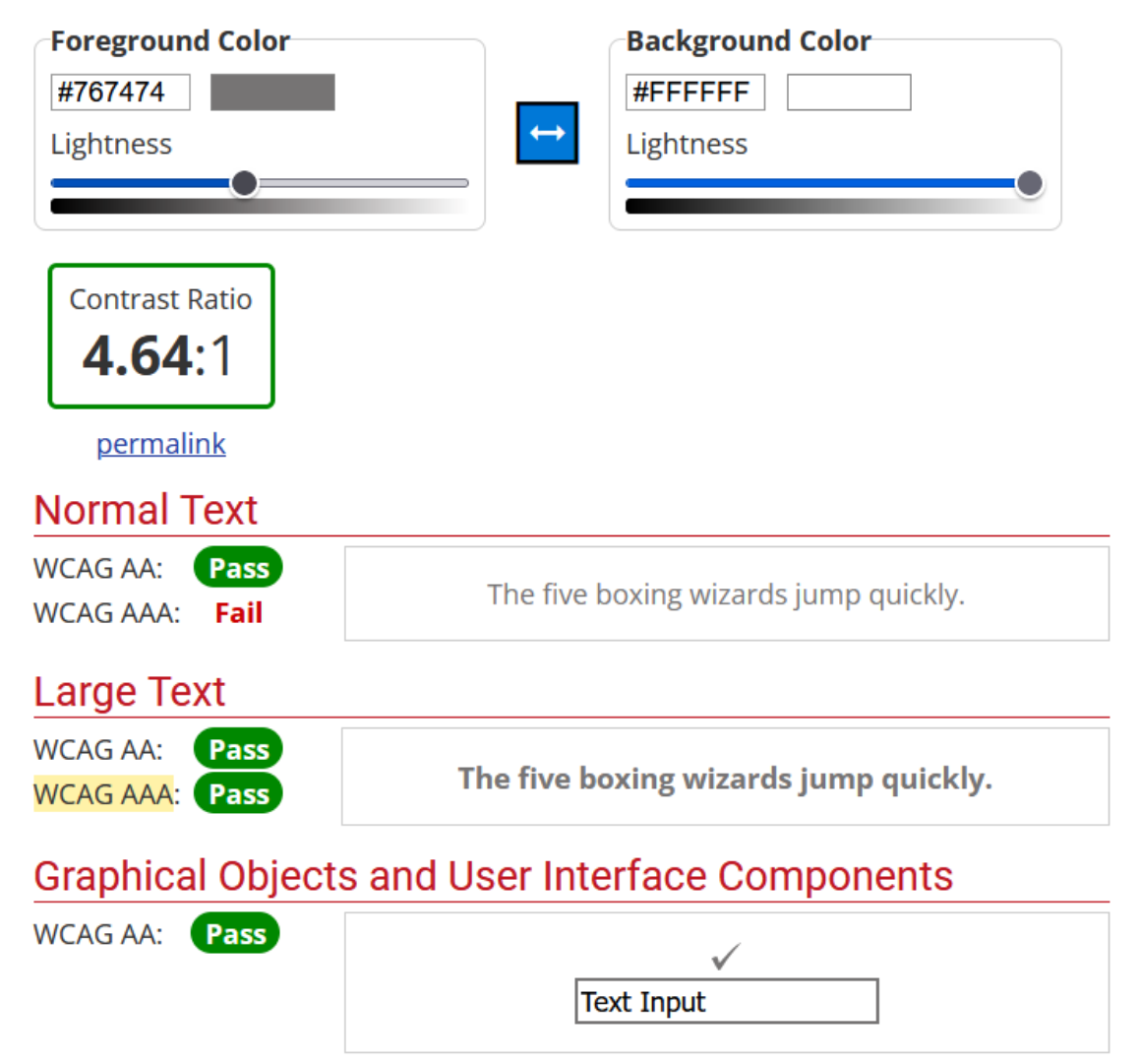
Accessibility
Giving plenty of spacing, line-height and ensuring that
color contrast passed WCAG AAA makes design better for
accessibility. If we used lighter greys on a white background,
we ensured that the text is bold.
Our goal is to minimize the number of clicks and pages without sacrificing information or user
experience. We looked out how other booking flows do it, websites such as Airbnb, Expedia.
Originally we were going to make selecting duration, and guests on two separate pages. Because
we are trying to decrease the number of pages, we looked for a different solution.
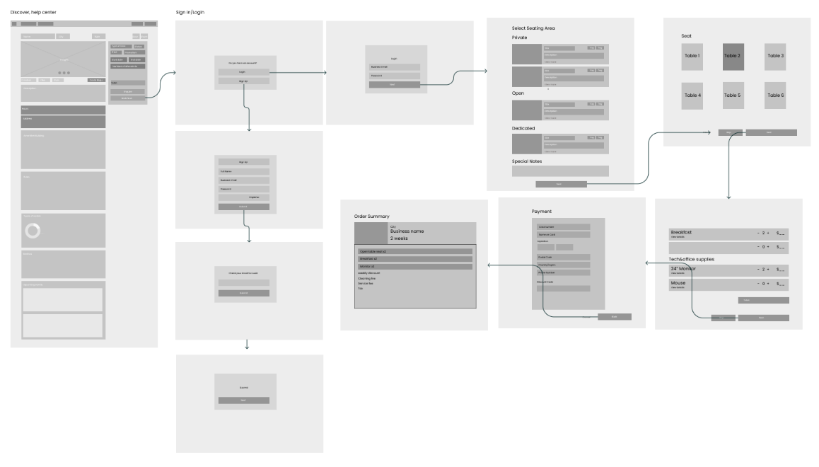
Airbnb does a good job of locating a side nav where users
are able to select date and view the estimated cost.
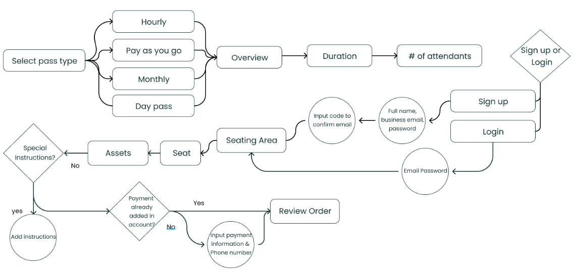
To narrow down the scope we made the decision that the front page of this website will not be designed at the moment. This page will allow user to choose what type of pass they want in the first place (Pay as you go, monthly etc.)

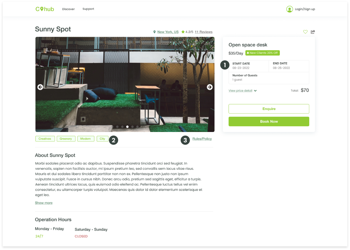
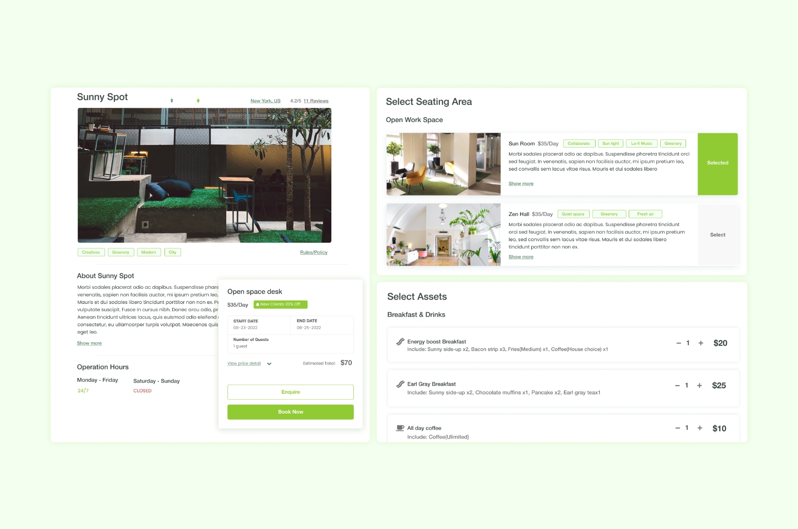
1. Left Side Nav
Add left hand side nav that includes to separate actions to 'book now' or 'enquire'.
Selecting date and end time to see the total cost live. It also cuts down on the flow.
2. Add tags
Add tags based on the enviornment and the type of users that normally work.
3. The rules
Have access right away to the rules & policies. This should also be sent to them in the flow and
email as well.
*Below the fold design in progress

5 Step Flow
Why 5? We generally enjoy odd numbers and that's why we split seating area from seat. However,
it also means that it has it's own dedicate page and there's less need to scroll. In addition to
seating would only show once the seating area is selected.
In this instance, the location requires online payment.
We ensured that we gave the user a moment to review everything before booking as well.
*Below the fold design, seat selection, payment and review is in progress
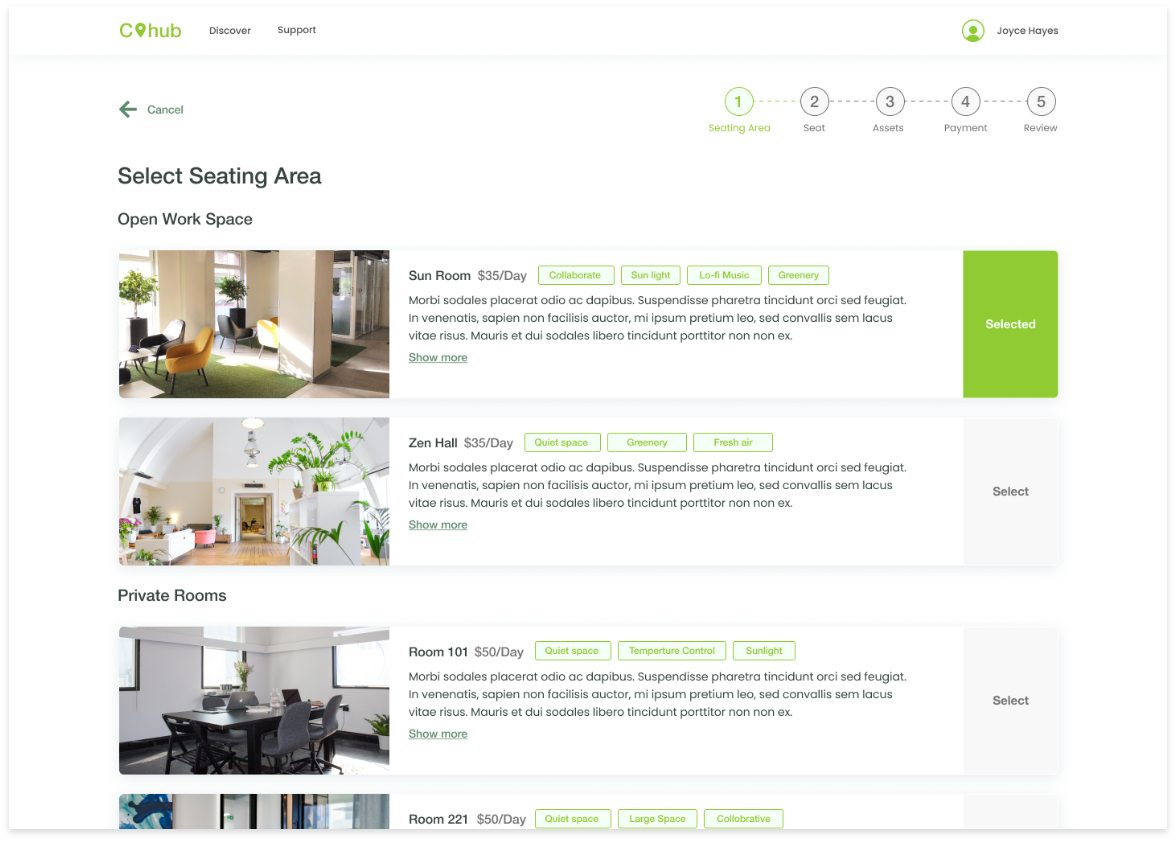
1. Image of Room
Having image of the space would help better sell that seating area.
2. Tags to sell location
Including the type of enviornment, such as "quiet" or "collaborative"
3. Show more
This would display the unique amenities that specific room has.
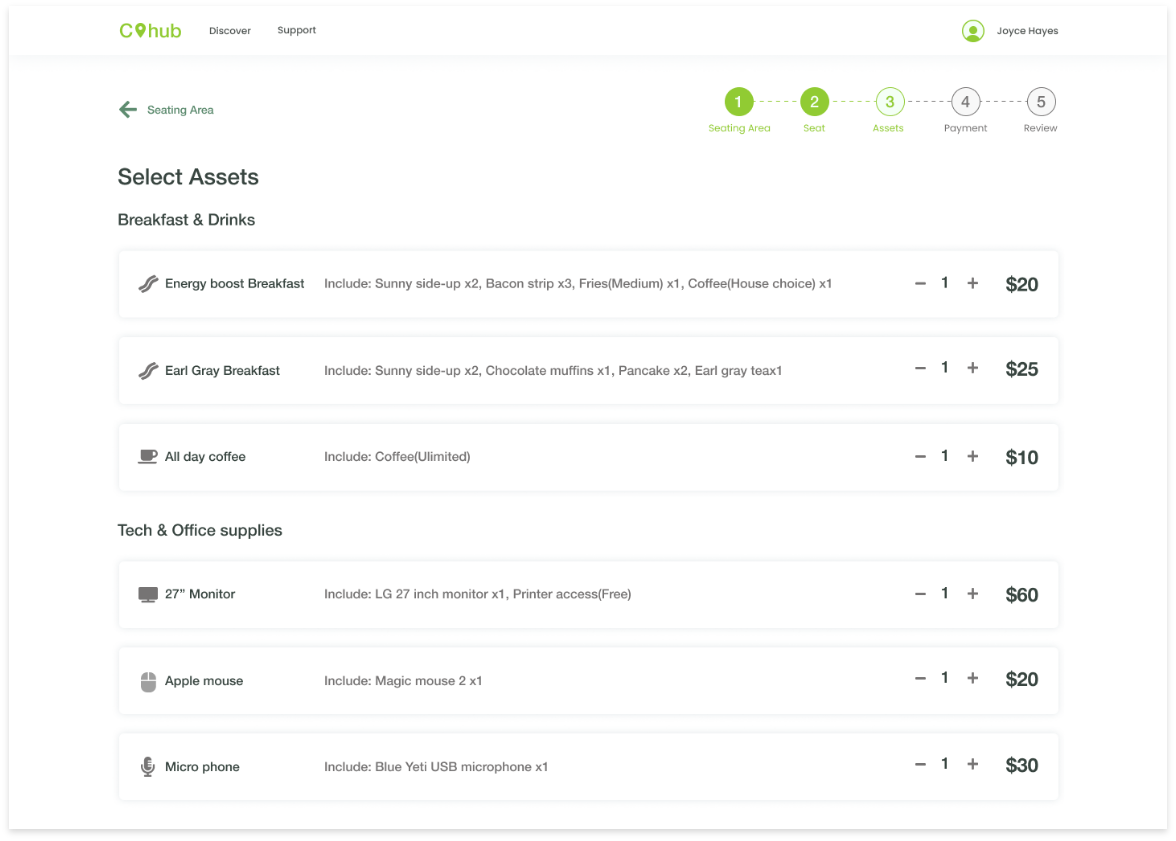
Allow users to select what they need before they arrive, and discover if this is an additional cost. This step is also made to be skippable.
- Contain information required such as duration,
and guests at the start, and allow users to see
what this may cost them.
- Only include what's relevant to their flow. Have they booked this place before? There should
be an option to quickly book it again if they already have an account *this design is in
progress
- Combine some elements as we did with duration and guest. Select Area and seat could have been
combined as well if this flow was even longer.
- Ensure you give them a 'skip' button.
- Have 'view details' to hide long information
This project is in progress. We're looking forward to finishing the UI and conducting some user
tests.
View about me & my experiences
View more work
Go to top