Product Design of Ecobin App for Hackathon
The product Design of a Garbage sorting App using machine learning & location to sort it into correct bin.
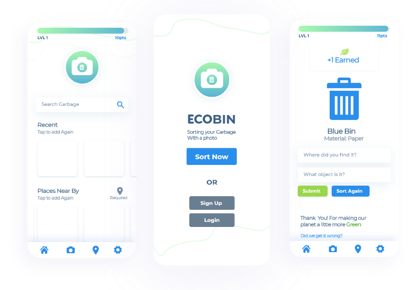
The product Design of a Garbage sorting App using machine learning & location to sort it into correct bin.

How can we educate Canadians on the benefits of recycling properly and reduce the economic impact of contaminated recyclables?
Target Audience is 14 to 35 with the characteristics of a busy life style, consistently have their phone on them, prefer to be eco-friendly but does not always go out of their way. They are often confused on the best way to recycle. Their main pain points is spending too much time to sort, not having an accessible tool to use, awareness, and the motivation to build a eco-friendly habit.
Our team consistent of four individuals who took roles of Business Analyst, Developer, Data Scientist and myself - UX & UI and front-end. I took part in ideating the problem statement, the solution and the presentation as well. Our team was chosen for us; therefor, when I arrived at the hackathon I had not met the other members before the day of the hack.
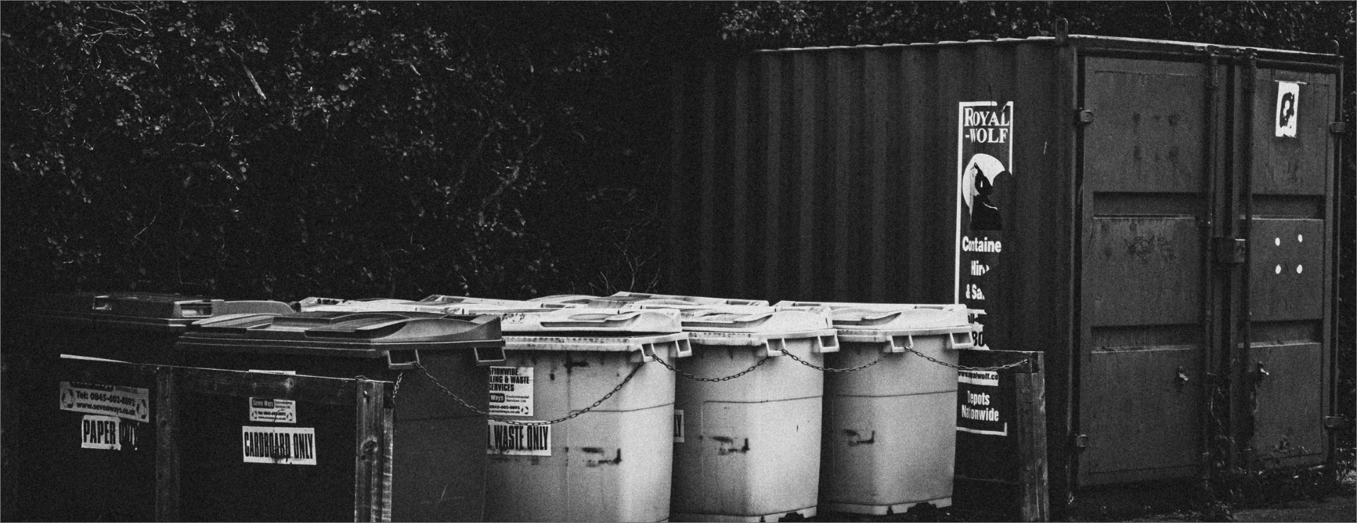
Discovery of the problem was expressing our frustrations of daily interactions. Recycling was a prime example of a struggle I faced. It was a realization that others faced the same challenge.
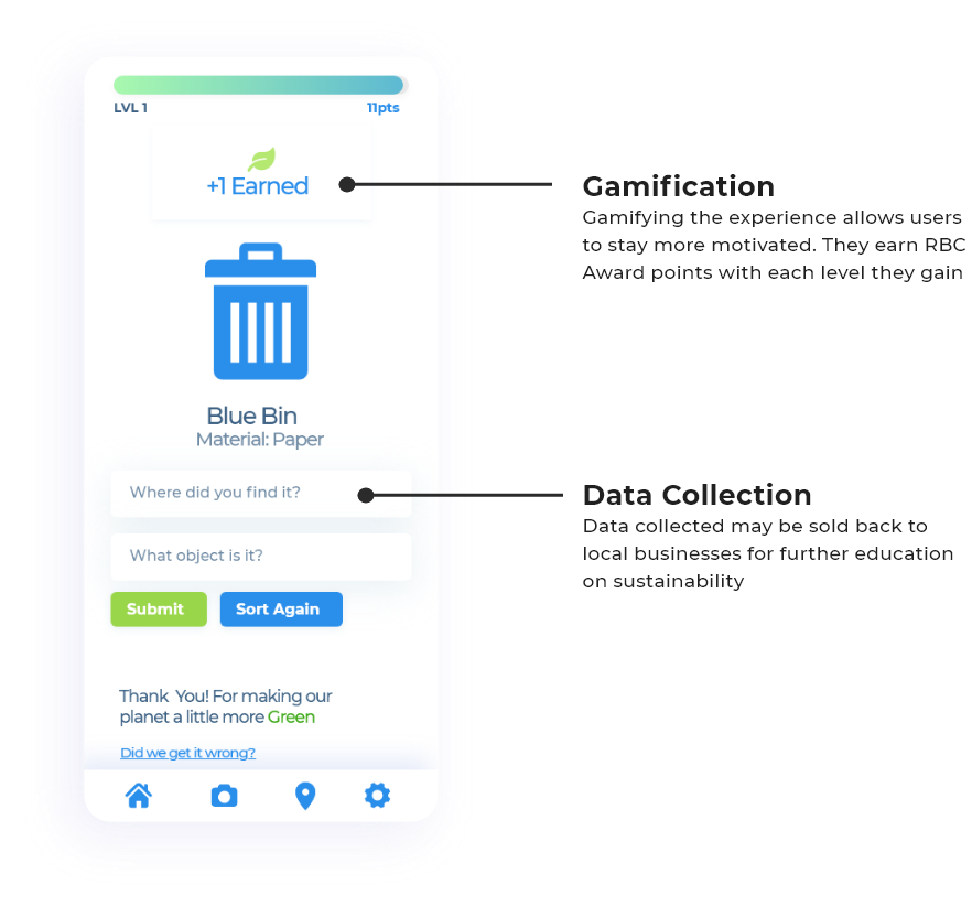
Defining the problem statement and understanding the pain points came next. A product criteria was developed: it must beaccessible, fast, educative, adoptable for businesses, lower cost and motivative . We developed solutions: camera sorting, trash geolocation, strong user experience for fast navigation, gamification for motivation, and data collection. One dedicated Userflow was decided upon. Once the wireframe was developed, I spoke to others to receive feedback. Afterwards, a style guide was developed and the prototype was made. I coded four pages of the front-end as a web application, working along side the developer to meet requirements.
Web Application that uses machine learning to sort items into the correct bin using: user's location, QR code to activate & gamification to motivate
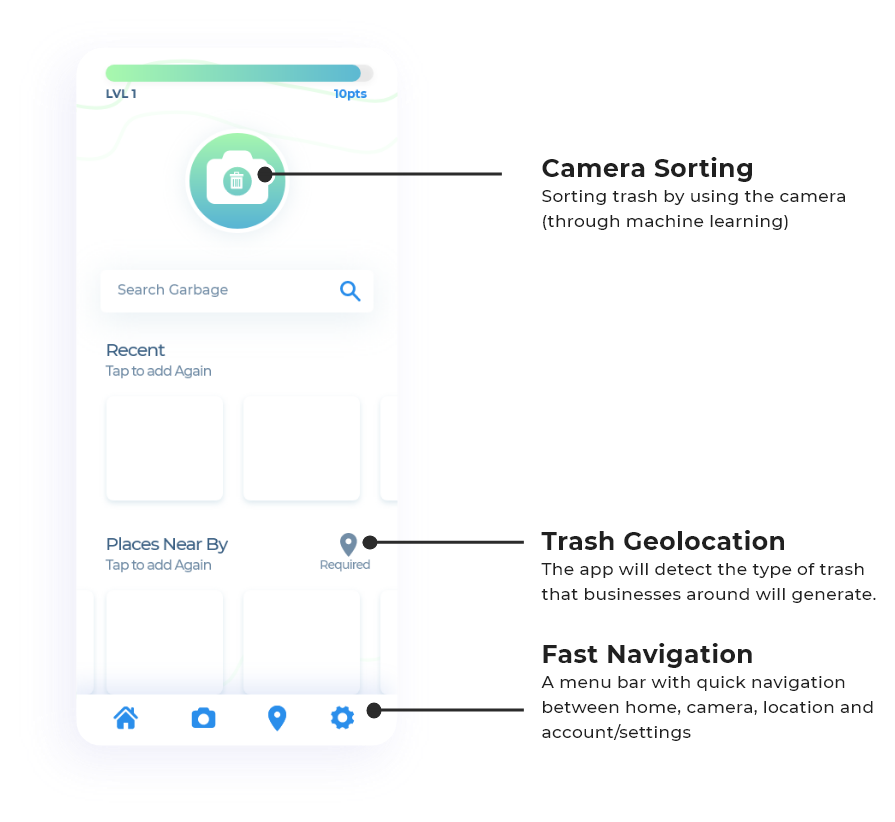
Ultimately, we reached our goal. We developed the Userflow that we determined was right for the presentation. We ran into trouble where the code broke near the last few hours but we managed to allocate time to fix the issue. I paired with the business analyst to finish the presentation, while the developer and data scientist worked to fix the problem.
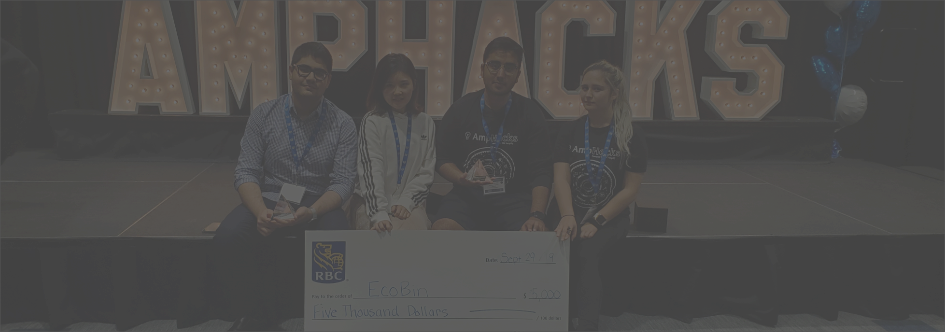
Team Ecobin won first place from a successful
presentation, solution, design and proof of concept.